Imagine walking past a pizzeria, your senses enticed by the irresistible aroma of melting cheese and warm dough. This experience is enhanced by a glimpse of the eatery’s logo, an integral part of the pizzeria’s identity. Much like a signature soft-serve ice cream flavor, this icon sets one establishment apart. More than just an illustration, the perfect logo mirrors the brand’s character, from the color scheme to the font choice. It’s like a scoop of your favorite flavor on a sundae, leaving a lasting impression on the visitors. So, how does one design a pizzeria logo that appeals to all? Let’s embark on this journey, sprinkling our path with the necessary cookies of creativity and dollops of branding wisdom to craft the perfect Pizzeria Logo.
Why is a Pizzeria Logo Important?
A Pizzeria logo is not just a design; it’s a symbol, an emblem that embodies the brand’s essence. Picture this: a passerby glances at your pizzeria logo and instantly triggers a gustatory symphony. The delightful vision of a perfect pizza – molten cheese cascading over a medley of succulent toppings encased in a crust baked to golden perfection. The logo is the promise of this gastronomic adventure. It’s like the cherry on top of a sundae, pivotal yet subtle.
By adopting a unique logo, a pizzeria gains more than just a visual identifier; it secures its spot in the competitive landscape. Each visit to the pizzeria, symbolized by the logo, becomes a cherished memory, much like savoring a favorite ice cream flavor. It’s a powerful marketing tool, stirring a sense of familiarity and loyalty among customers.
Indeed, the logo is a silent ambassador, greeting visitors before they enter the pizzeria. It’s reminiscent of that first mouthful of a soft serve ice cream – unforgettable, irreplaceable. In conclusion, a Pizzeria Logo is as essential to the brand as the savory sauce to a pizza, binding all the elements together into a harmonious whole.
What to Consider When Making a Pizzeria Logo
Crafting a pizzeria logo is akin to kneading the perfect pizza dough – detailed, artistic, and demanding a unique touch. It’s a creative process that calls for more than just a flair for design.
- Brand Identity: Just as the favorite ice cream flavor leaves an indelible mark on one’s palate, a logo should represent the pizzeria’s personality and offerings. This requires delving into what makes your pizzeria unique, like a distinctive soft-serve ice cream variant.
- Color: The color palette plays a vital role. Much like the variety in an ice cream parlor, diversity in color can create a vibrant and engaging visual cue. The chosen hues should reflect the ambiance of the pizzeria, pleasantly reminiscent of a scoop of a favorite flavor.
- Font: Selecting the right font is akin to picking the perfect ice cream icon – significant and potentially challenging. It should blend seamlessly with the overall design like premium ice cream complements a sundae.
- Simplicity: Paradoxically, much like the pleasure of a simple ice cream cone, the most impactful logos are often the simplest. Streamlined designs are easily recognizable, like a favorite chocolate flavor, amidst myriad ice cream options.
In essence, crafting a pizzeria logo that stirs up emotions akin to savoring one’s favorite ice cream flavor requires a blend of strategy, design understanding, and a dash of creativity. Sprinkled with branding expertise, analytical cookies of thought can help in baking this perfect logo.
Pizza POS Comparison Tool
Introducing our ‘Pizza POS Comparison Tool,’ a culinary compass that guides you through the landscape of Point-of-Sale systems. Like savoring a scoop of your favorite ice cream flavor, exploring our tool is an experience. It offers a buffet of options akin to an ice cream parlor brimming with choices. Each POS system is presented like a unique flavor, with detailed specifications that mirror the depth of an ice cream sundae.
Moreover, our tool is user-friendly and immediate, much like a soft-serve ice cream. Simplicity is our mantra, much like relishing a cone of classic vanilla. The interface is as smooth as a scoop of premium ice cream, with easy-to-navigate options. You’ll find the perfect POS system for your pizzeria with just a few clicks, akin to bites into a delicious ice cream cake.
Our ‘Pizza POS Comparison Tool’ is like an ice cream icon – a symbol of choice, satisfaction, and delight. Therefore, buckle up for this feast of information as delightful as your favorite ice cream flavor.

How to Make a Pizzeria Logo
Crafting a pizzeria logo is akin to whipping up a delightful pizza – a compelling blend of art, taste, and passion. Much like a perfect pizza, the logo starts with a vision, gets kneaded with creativity, and finally bakes under the heat of brand identity. The result? A symbol as tasty as a pizza fresh out of the oven, radiating with the warmth of your brand.
- Start with your brand: The first ingredient in this recipe is your brand’s ethos. Just like the base of a pizza, your brand forms the foundation for your logo. Much like a favorite ice cream flavor, this identity should leave a distinctive taste in the viewer’s mouth.
- Build your vision: Next, it’s time to sprinkle your vision onto the brand base. Much like the alluring aroma of baking dough, the logo should emit the essence of your vision. Remember, every stroke of the design, like each topping on a pizza, plays a vital role in the overall flavor.
- Choose a pizzeria logo design avenue: Select a design avenue for your logo. Here, you pick the right font, color, and icon, much like choosing the right blend of cheese, sauce, and crust for the perfect pizza. Choose wisely, as this will be the cherry on top of your brand sundae, the visual appeal that draws customers in.
In essence, shaping a pizzeria logo that resonates with customers is akin to perfecting a signature pizza recipe. Just as visitors savor each bite of your pizza, they should relish the sight of your logo. So, lace up your creative boots, and let’s embark on this artistic journey to bake the perfect pizzeria logo.
What Makes a Great Pizzeria Logo?
Like a perfect pizza, an incredible Pizzeria Logo is a sensory feast. Just as seeing a well-prepared pizza with molten cheese, golden crust, and an array of vibrant toppings brings anticipation, a well-crafted logo should elicit a wave of curiosity and excitement.
The logo’s palette, like the colors of a pizza, should be as appealing as a scoop of your favorite ice cream flavor. It should resonate with the brand’s ambiance, subtly reflecting its character. Transitioning from the color, we move to the font.
Much like an ice cream icon, the font should harmoniously blend with the design, adding a distinctive touch to it. It shouldn’t be a random selection but a well-thought-out decision, like picking the perfect ice cream flavor.
Moving forward, we find that simplicity is key. Much like the pleasure derived from a simple cone of ice cream, a streamlined logo is easily recognizable, memorable, and impactful.
Finally, the logo should be as unique as the pizzeria itself. Like the signature flavor of a soft serve ice cream that sets it apart, the logo should echo the pizzeria’s individuality. An incredible Pizzeria Logo is a visual treat that leaves a lasting impression, much like a pizza or your favorite ice cream.
Conclusion
In the exhilarating journey of crafting an unforgettable Pizzeria Logo, each step, like savoring a favorite ice cream flavor, has been a treat. As we reach the end of our guide ‘How to Make a Pizzeria Logo,’ we step back to admire our creation. A logo radiant with the essence of your brand and as appealing as a perfect pizza. A symbol that, much like a soft serve ice cream, is unique, impactful, and memorable. With Orderific, your Pizzeria Logo becomes more than an emblem; it becomes a vehicle for enhanced customer experience, increased revenue, and efficient operations. By integrating with leading POS systems and payment partners, Orderific helps you focus on what truly matters – your brand and customers. For more information on Orderific, schedule a FREE DEMO today.
FAQs
How can a pizzeria logo capture the essence of the restaurant’s style and menu?
A pizzeria logo can encapsulate the restaurant’s style and menu through thoughtful color choices, font selection, and relevant imagery.
Are there specific design elements that instantly communicate the concept of a pizzeria?
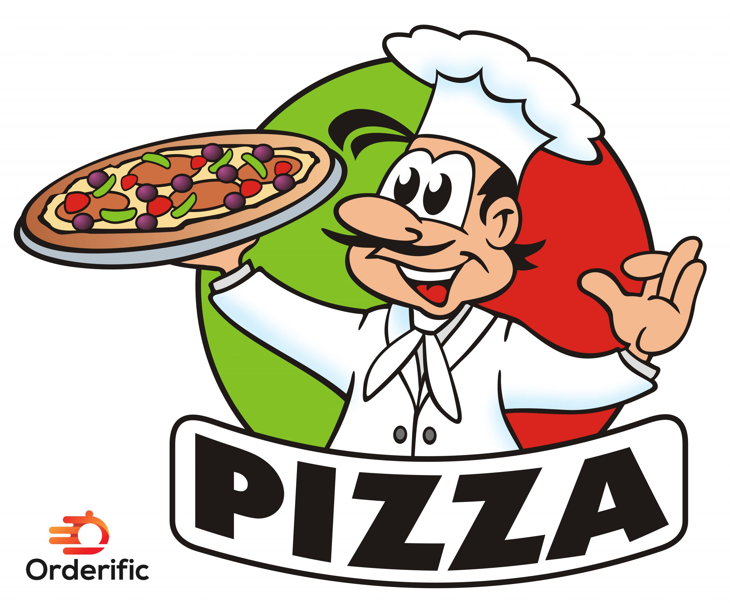
Absolutely. Elements like pizza slices, a chef’s hat, Italian colors, or even a stylized drawing of a wood-burning oven.
What colors and imagery are commonly associated with pizzerias and their logos?
Standard colors include red, white, and green, symbolizing Italy. Imagery often features pizzas, chef’s hats, and wood-fired ovens.
How does a well-designed pizzeria logo contribute to brand recognition and customer loyalty?
A well-designed pizzeria logo builds brand recognition and customer loyalty by creating a memorable and distinctive visual identity.


