Introduction
Welcome to “Sunrise Indulgence: Crafting a Memorable Breakfast Menu,” your guide to creating a breakfast menu Design that is a feast for the taste buds and a visual delight. From piping hot pizzas topped with gooey cheese and crunchy corn to healthy meals packed with protein-rich eggs and succulent poultry, designing a menu involves much more than listing food items. It’s about creating an enticing text description that makes your customers’ mouths water, choosing the right colors and images to enhance the appeal of your dishes, and even incorporating an activity sheet or puzzles for adults looking for a bit of fun with their morning coffee.
How To Create A Breakfast Menu Design
Selecting Your Dishes
The next step is to select your dishes. You can opt for classic breakfast favorites, like pancakes, waffles, and eggs benedict, or experiment with more adventurous choices. Remember, diversity is vital. A good breakfast menu should cater to various dietary needs and preferences. Also, consider adding a section for smoothies, juices, and different coffee options.
Design And Colors
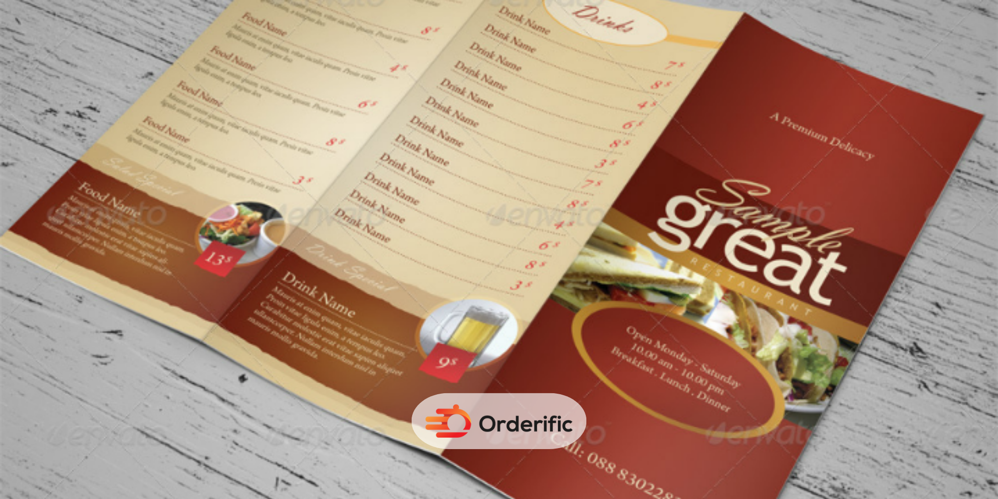
Now, let’s talk design. Your menu should be visually appealing and easy to read. Choose a simple yet attractive layout with clear sections and headings. As for colors, opt for warm and inviting tones that stimulate appetite, like reds, oranges, and yellows. Remember, the color scheme should be consistent with your brand’s theme. You can also use images, but avoid overcrowding your menu.
Activity Sheets And Puzzles
Aside from your delicious breakfast options, why not incorporate an activity sheet or puzzles into your menu? This could be a fun crossword or trivia quiz related to your dishes. It’s a unique way to engage your customers and keep them entertained while they wait for their meal.
The Power Of Good Breakfast Menu Design
A well-designed menu does more than just list food items; it’s a powerful marketing tool that can significantly influence a customer’s dining experience. It embodies your brand’s personality, sets the tone for the customer’s visit, and guides their choices. When designed correctly, a menu can effectively highlight your best-selling items, enticing customers to try them. Here, we will delve into the psychology of menu design, discussing the strategic placement of dishes, the importance of typography, and the subtle use of colors and images to influence customer decisions. Remember, a visually appealing menu design can translate into repeat visits and higher sales, so it’s worth investing time and creativity to develop a good menu that works strategically for your business.
How To Make A Breakfast Menu
1. Write Out All Menu Items
Firstly, you must write out all the items you plan to include on your breakfast menu. This includes main dishes, side dishes, drinks, and any specials you offer. Cover various tastes and dietary preferences to appeal to a broad audience. For each item, please write a brief but enticing description that states what the dish is and highlights its unique attributes and ingredients. Consider using adjectives that evoke the senses to help your customers imagine the dish’s taste, texture, and aroma. This step is crucial, as it enables you to visualize your menu and serves as a foundation for the next steps in the design process.
2. Categorize Menu items
Group similar items together under clear headings such as ‘Main Dishes’, ‘Sides’, ‘Beverages’, etc. This makes your menu more straightforward and helps customers make decisions faster. Try to arrange the categories where people typically eat their meals, starting with beverages and appetizers, then main courses, and ending with sides and desserts. Consider including a ‘Specials’ or ‘Chef’s Recommendations’ section to highlight your signature dishes or seasonal offerings. These sections often draw the eye first and can encourage customers to try something new.
3. Set Menu Prices
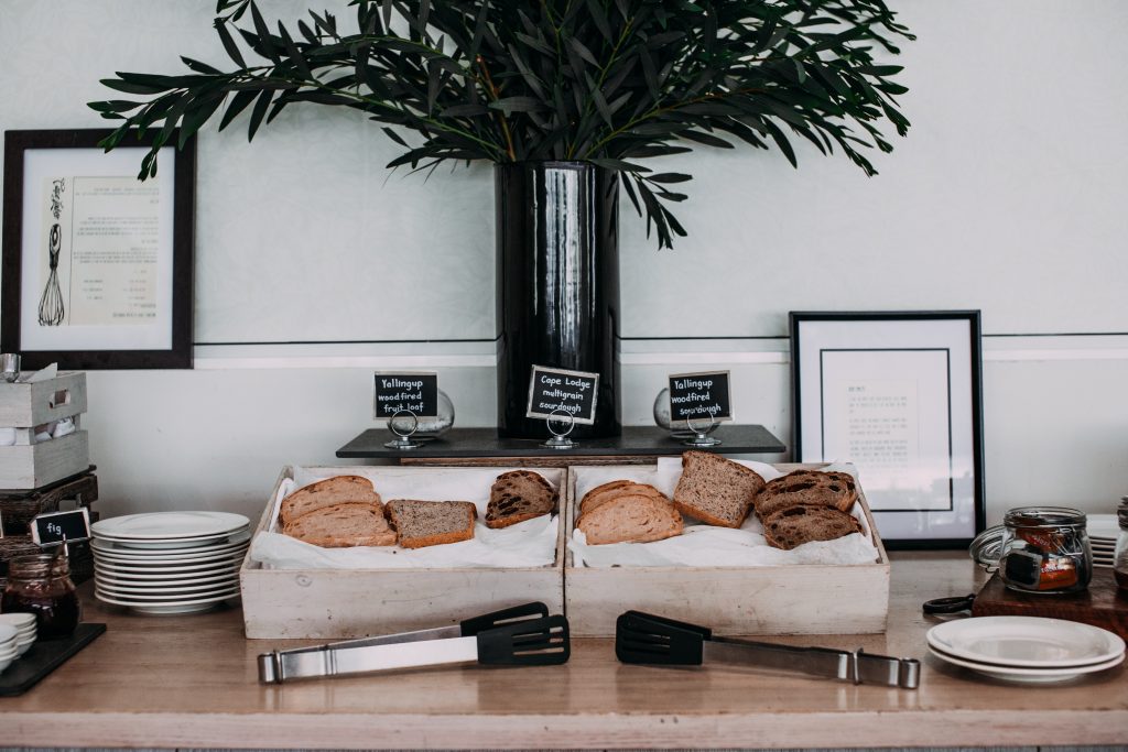
Determining the right prices for your menu items can be a delicate balancing act. On one hand, you want to ensure your prices cover the costs of ingredients and preparation, and on the other, they must be in a range that your customers find reasonable. In addition, your pricing should also reflect the quality and uniqueness of your offerings, while remaining competitive within your market. Once you have determined the prices, it’s crucial to display them clearly, but subtly. The goal is to have your customers focus on the delicious offerings and not the cost. Place the price after the dish description, and avoid using dollar signs, as research suggests that customers tend to spend less when menus show prices with dollar signs. Remember, transparency is key — hidden charges or unclear pricing can lead to customer dissatisfaction.
4. Create Menu Descriptions
Next, craft compelling descriptions for each dish on your menu. A good description not only explains the dish but also sells it. Use sensory words to describe the texture, taste, and aroma of the dishes. Highlight special ingredients, cooking techniques, or any unique aspect of the dish. But remember, keep it short and simple. Long, complicated descriptions can overwhelm customers. Also, maintain a consistent style throughout. If you start with an adjective (e.g., ‘Crispy Bacon’), continue the same pattern for all descriptions. This consistency enhances readability and gives your menu a professional look.
5. Decide On A Breakfast Menu Design Color Scheme
Choosing the right color scheme is pivotal to the overall design of your breakfast menu. Colors have the power to evoke emotions and certain colors may even stimulate the appetite. Warm colors such as red, orange, and yellow are known to be appetite stimulants and can be great choices for a breakfast menu. However, the colors should also align with your brand’s image and theme. Make sure to use colors consistently and sparingly, as an overload of color can make the menu look cluttered and unprofessional. Remember, the goal is to create a visually appealing menu that resonates with your customers and enhances their dining experience.
6. Outline Your Breakfast Menu Design
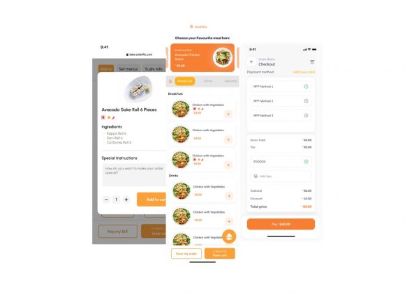
Start by choosing a layout that’s clean and easy to navigate – remember, your menu should guide your customers’ eyes effortlessly from one section to another. Use fonts that are legible and sizes that differentiate between the title, headings, and descriptions. Include high-quality images of your dishes – this not only makes your menu more appealing but also gives customers a visual expectation of what they will be served. Incorporate your brand’s logo and colors into the design for a cohesive look. If space permits, consider adding an activity sheet or puzzles – this is a fun addition that can keep customers engaged while they wait for their meal.
7. Think About Photos
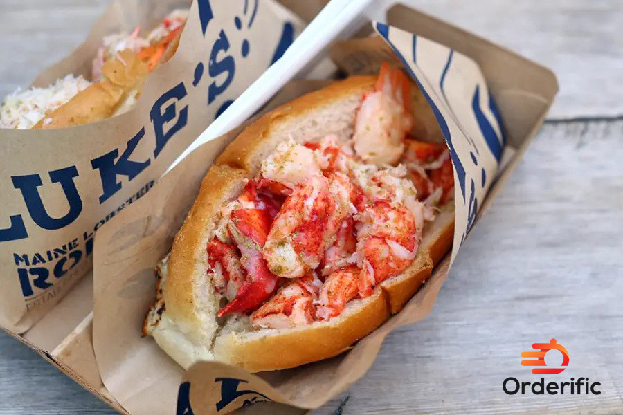
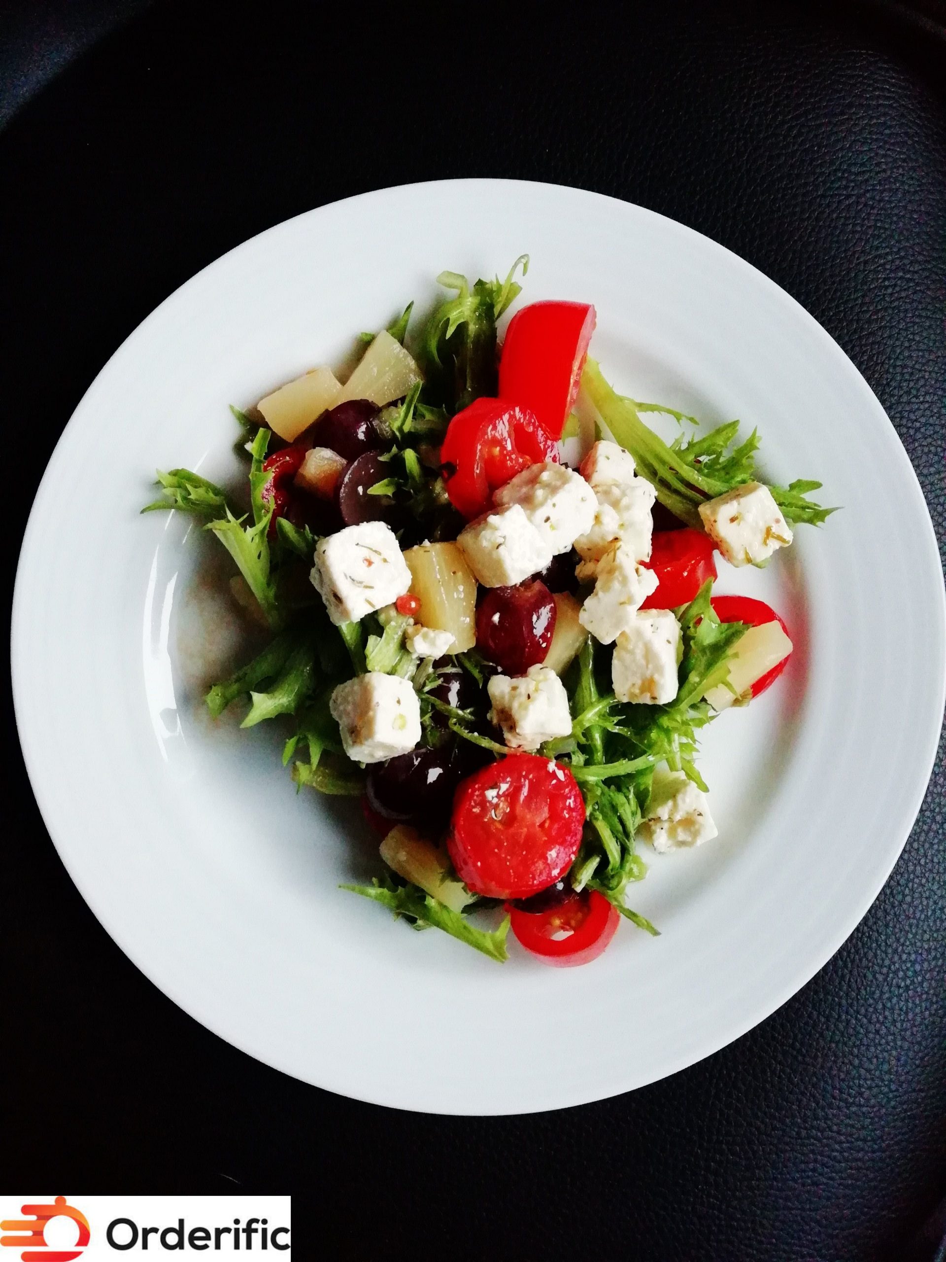
Photos can greatly enhance your breakfast menu, giving customers a visual representation of the delicious dishes they can expect. High-quality, mouth-watering pictures can entice customers to try dishes they might not have considered otherwise. However, remember to keep it balanced. Too many photos can clutter your menu and detract from its overall design. Opt for professional photos that accurately represent your dishes, making sure they align with the overall theme and color scheme of your menu. Images should be placed strategically, preferably next to the dish description, making it easy for customers to associate the photo with its corresponding dish.
8. Choose Menu Fonts, Spacing, And Composition
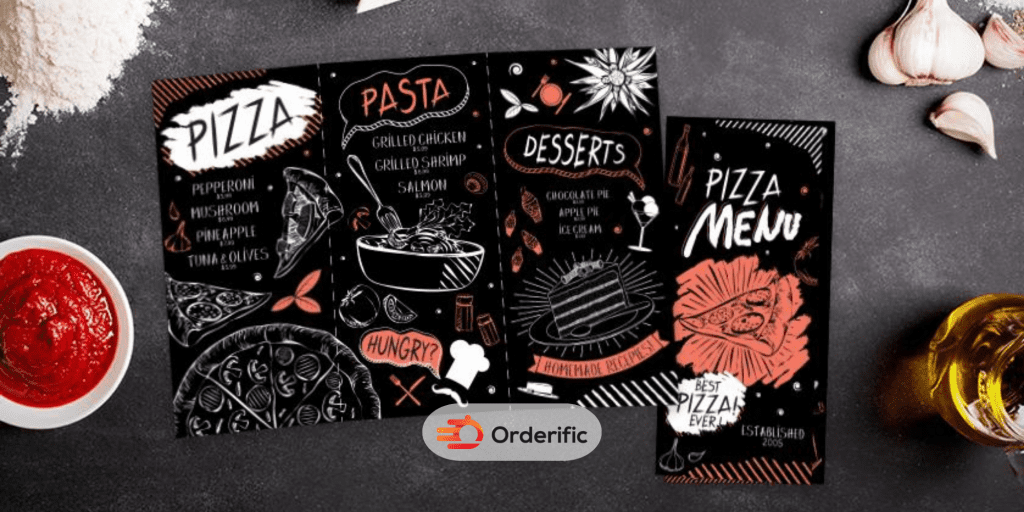
When it comes to menu design, your choice of fonts, spacing, and overall composition play a crucial role. Begin with selecting a font that aligns with the personality of your restaurant. Serif fonts may add a touch of elegance, while sans-serif fonts could give a modern, clean look. Ensure your chosen font is easy to read and sizes differentiate between dish names, descriptions, and prices. Spacing is equally important; overcrowded menus can appear chaotic and may be challenging to navigate. Leave ample white space around items to enhance readability and guide the customer’s eye. Lastly, the composition, or layout of your menu, should be logical and intuitive. Start with beverages, followed by main dishes, sides, and end with desserts. Keep similar items grouped together for a seamless experience. Remember, your menu is a reflection of your restaurant’s brand, so make every design decision count.
9. Select The Final Menu Layout
After you’ve made crucial decisions about the dishes, descriptions, color schemes, and photos, it’s time to choose the final layout for your breakfast menu. This is where all the elements come together to form a coherent and captivating design. Use a logical flow, positioning the breakfast items in the order your customers would typically consume them. Create clear divisions between different categories like mains, sides, and beverages. Balance out text with visuals, ensuring that your high-quality images don’t overcrowd the menu. Incorporate your chosen colors, keeping them consistent throughout the layout. Allocate an appropriate amount of white space to prevent an overcrowded, chaotic appearance. Lastly, proofread thoroughly before finalizing. Errors can detract from your menu’s professionalism, no matter how stunning the design may be. With your final, well-thought-out layout, you’re ready to captivate your customers with an enticing and visually appealing breakfast menu.
10. Proofread And Print Your Breakfast Menu Design
Proofreading is an essential step before printing your breakfast menus. Scrutinize every detail, from the spelling of dish names to the consistency of price listings. Make sure the dish descriptions are persuasive and free of ambiguity. Check that your layout is logical, the font is readable, and the color scheme is pleasing to the eye. Also, ensure the images used are high quality and accurately represent the dishes. Once you are confident that your menu is error-free and beautifully designed, proceed to print. Consider using a quality paper that complements your design and withstands frequent handling. Finally, distribute your menus and watch your carefully designed breakfast offerings delight your customers!
Conclusion
In conclusion, crafting a compelling breakfast menu goes far beyond listing delicious dishes. It’s about creating an unforgettable dining experience right from the moment your customer sets their eyes on the menu. From strategic dish placement, engaging descriptions, and the subtle use of color, to the choice of font, imagery, and even the quality of paper on which the menu is printed, every detail contributes to the overall impression of your restaurant. And remember, a well-designed menu doesn’t just tantalize the taste buds, it can also significantly influence customer choices and drive sales. So, don’t hesitate to invest time, creativity, and thought into designing a menu that truly encapsulates the essence of your eatery and the delightful breakfast you serve. If you need assistance in creating a perfect breakfast menu, Orderific is here to help. Book a demo with us today, and let’s elevate your breakfast menu together.
FAQs
How can a visually appealing breakfast menu attract customers?
A visually appealing breakfast menu design can entice customers by showcasing mouthwatering dishes in an aesthetically pleasing and easily navigable format.
What should be considered when designing a breakfast menu layout?
When designing a breakfast menu layout, consider factors like readability, logical flow, use of images, color scheme, and branding consistency.
What are some creative ways to present breakfast options?
Creative breakfast presentation can include unique food pairings, themed menus, and visually appealing dish arrangements.
How does a well-designed breakfast menu influence diners’ choices?
A well-designed breakfast menu can guide diners’ choices by highlighting special dishes, creating enticing descriptions, and offering visually appealing photos.


